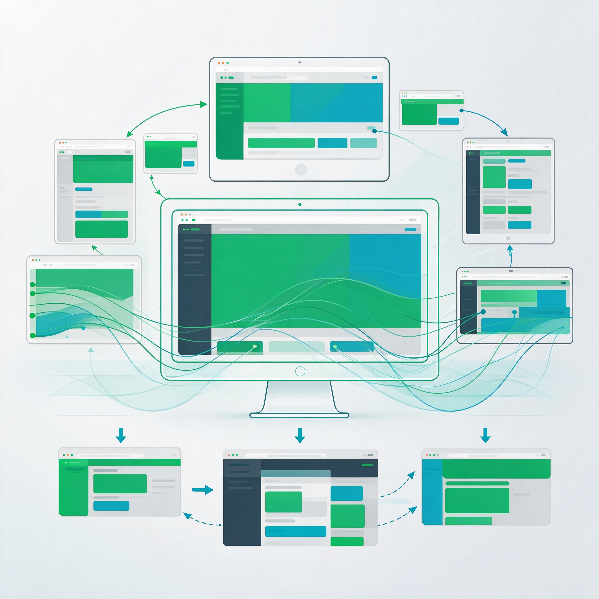
This process addresses the adaptation of animations for multi-screen web design, adjusting parameters—such as duration, displacement, layer count, trigger conditions, and asset specifications—to suit varying screen widths, aspect ratios, and interaction modes. Before production, we analyze page breakpoints, component layouts, and content hierarchy to determine which animations should be fully rendered on wide screens versus those that should be simplified or converted to static elements on narrower screens, ensuring that motion does not obscure content or hinder user interaction on smaller displays. The workflow encompasses breakpoint auditing, the establishment of adaptation rules, keyframe adjustments, asset tiering, front-end implementation, cross-device testing, and final delivery. Deliverables include responsive animation guidelines, breakpoint documentation, simplification rules, asset inventories, trigger logic, implementation notes, and fallback strategies. Animations are recalibrated—adjusting motion paths, anchor points, and visible areas—to align with layout shifts, ensuring consistency with grids, cards, navigation, and form components. We rigorously test scenarios such as orientation changes, window resizing, rapid scrolling, touch interactions, and keyboard navigation to prevent layout instability or accidental triggers. Performance is optimized through tiered asset loading based on device capabilities, managing initial page weight and rendering overhead, while also providing a “no-animation” state. The final acceptance phase involves verifying performance across all breakpoints, asset swapping, trigger boundaries, and maintenance documentation, ensuring that responsive animations remain stable, clear, controllable, and scalable within the web design.